
2016年6月2日 Instagram 有新Logo,設計師們兩極化反應 – UX / UI / VI / APP
Instagram 有新Logo,設計師們兩極化反應 – UX / UI / VI / APP
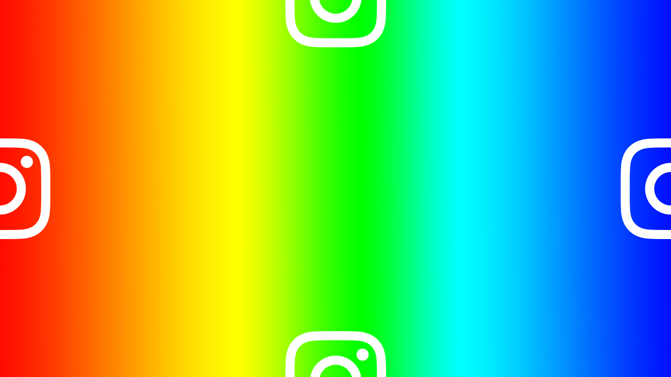
VI | Instagram 有新Logo …欸,不太好看。
( 我們短評:金屬感彩虹漸層太搶戲 )#Instagram
設計師們也反應兩極意見:
Tobias van Schneider :
我總是稱讚他們的Instagram標誌,可以保持強勁,而不是隨波逐流…
I always admired Instagram for their icon/logo, staying strong, not following the trends…
William Paterson :
說真的,@instagram App這次更新是偉大的!終於可以在白色的環境編輯照片……現在等待@vsco也一樣這麼作…
seriously, the @instagram app refresh is great! finally can edit photos on white… now waiting on @vsco for the same.
Diego Pulido:
這個@Instagram標誌或許很不討喜,但App設計確實是令人驚喜的。簡潔,並且將內容擺在中心的位置…
The @Instagram logo may be barfalicious, but the actual app redesign is truly amazing. Simple & making content the centre piece of each post
Jason Carreiro:
新@instagram LOGO設計感受是喜憂參半的。 ♥︎華而不實的漸層色…然後,我會想念以前友好的拍立得LOGO設計 http://bit.ly/1USUvAR
Mixed feelings RE new @instagram logo. ♥︎ the slick gradient… but I’ll miss the friendly lil Polaroid character http://bit.ly/1USUvAR
( 原文載自 creativebloq )